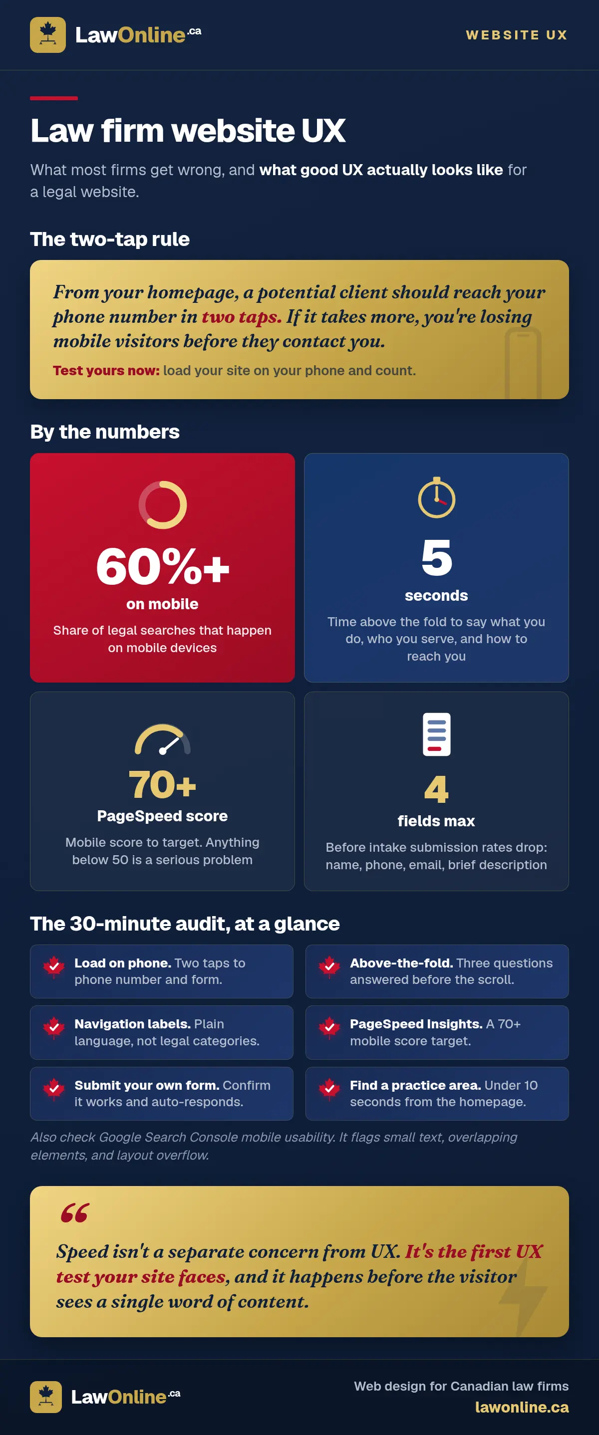
Your law firm website has one job: turn a visitor into a booked consultation. Not impress other lawyers, not showcase your office photography, not win a design award. If a potential client lands on your site and can't figure out how to reach you within a few seconds, the site has failed, no matter how polished it looks.
That's what user experience means for a law firm. UX isn't about aesthetics or trends. It's about whether a real person, often stressed and searching on their phone, can find what they need and take action before they lose patience and hit the back button. Most law firm websites get this wrong in predictable ways, and every one of those mistakes costs consultations. This article covers the law firm website best practices that actually move the needle, plus a 30-minute checklist you can run on your own site today.
What UX Actually Means for a Law Firm Website
User experience is the gap between what your site offers and what a visitor actually needs in the moment they arrive. For law firms, that gap is usually enormous because the site was built to reflect the firm's self-image rather than the client's situation.
Think about a personal injury client. They've just been in a car accident. They're searching from a hospital waiting room or their kitchen table, probably on their phone, probably anxious. They need to find a lawyer who handles their type of case and get in touch. That's it. The entire journey should be: Google search, land on the right page, see a phone number or short form, and make contact. Three steps, under a minute.
Now compare that to what most firm websites actually deliver: a homepage slideshow of downtown office views, a navigation menu organized around legal terminology the client doesn't use, and a contact form buried three clicks deep behind "About Us." The firm designed the site for itself. The client needed the site designed for them.

Good law firm UX means every page answers three questions immediately: What does this firm do? Do they handle my type of problem? How do I contact them right now? If a visitor has to hunt for any of those answers, the UX is broken, whether it's a solo lawyer website or a 40-attorney firm. For a deeper look at what separates effective law firm sites from decorative ones, see our breakdown of what makes a good law firm website.
The Navigation Architecture Problem
Most law firm sites organize their navigation around how the firm thinks about itself, not how clients think about their problems. You'll see menu labels like "Civil Litigation," "Insurance Defence," or "Tort Claims." These are internally accurate. They're also meaningless to the person who just slipped on an icy sidewalk outside a grocery store and wants to know if they have a case.
The fix is simple: label navigation by client situation, not by legal category. A personal injury firm that replaces "Litigation" with "Car Accidents," "Slip and Fall," "Wrongful Death," and "Workplace Injuries" immediately tells visitors where to go. A family law firm that replaces "Domestic Relations" with "Divorce," "Child Custody," and "Spousal Support" does the same thing. The menu should read like a list of problems you solve, not a list of practice areas you studied.
Navigation depth matters too. Every additional click between the homepage and the contact form is a point where clients drop off. If someone has to click through three menus to find the right practice area page, and then scroll past 800 words of legal background to reach the intake form, you've built a funnel that leaks at every stage. Poor law firm website navigation is the number one usability problem we see, and it's almost always fixable without a redesign. The best-performing law firm sites keep the contact action visible on every page, either as a sticky header button or a persistent sidebar form. For more on reducing that friction, our guide to law firm website conversion optimization covers the specifics.
A quick test: open your firm's website and pretend you're a potential client who has just been rear-ended on the 401. Can you find the right practice area and a phone number in two taps? If not, your navigation is costing you cases.
Mobile UX Is Where Most Law Firm Sites Lose Clients
More than 60% of legal searches happen on mobile devices, and that number skews even higher for emergency-intent queries. When someone searches "car accident lawyer near me" from a hospital parking lot, or "divorce lawyer Toronto" at midnight after a fight, they're on their phone. Your desktop layout is irrelevant to them.
Canada's numbers make this even harder to dismiss: 90% of Canadian households had smartphones in 2023, and smartphones were the most-used device for connecting to the internet, according to a 2024 TELUS-commissioned report on technology adoption. A Bank of Canada working paper puts it simply: five out of six Canadian adults regularly use a mobile phone. Your site either works on a phone or it doesn't reach most of the people looking for legal help.
The most common mobile usability failures on law firm sites are painfully consistent:
- Click-to-call is buried below the fold. The phone number should be tappable without scrolling. Period.
- Hamburger menus don't work properly. Expandable submenus that require precise tapping on a small screen frustrate users, especially when the menu items are long legal phrases.
- Forms require unnecessary typing. Asking someone to type their email address on a phone keyboard, fill in a date picker, or describe their case in a text area before you even ask for their name is backwards. Phone number first, everything else second.
- Text is too small or too wide. Body text that requires pinching and zooming means the site isn't truly responsive, it's just technically mobile-compatible.
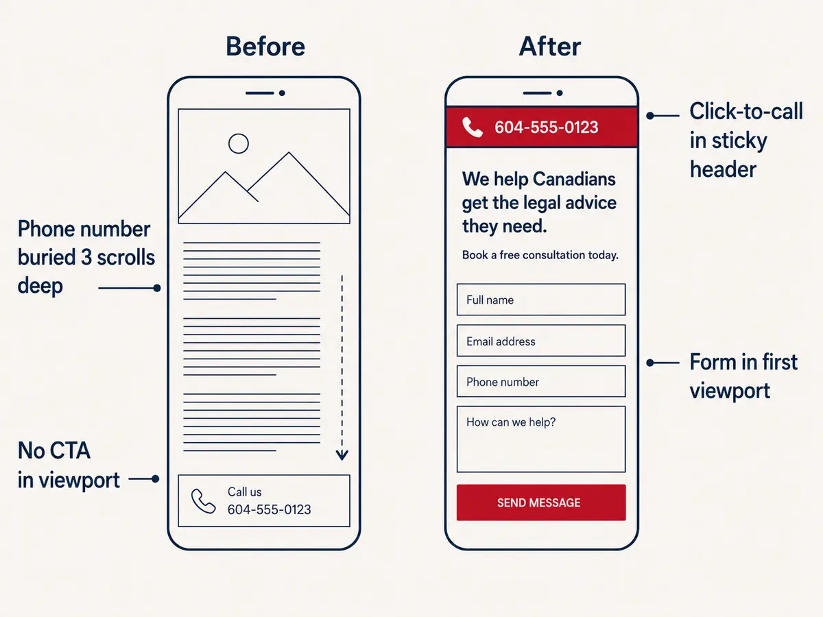
Here's a practical test. Pull out your phone right now and load your firm's website. Count how many taps it takes to get from the homepage to either a phone number or a contact form. If it's more than two, you're losing mobile visitors. A personal injury client calling from the scene of an accident has two thumbs and maybe one bar of signal. The intake experience has to work for that person, or it doesn't work at all.
Page Load Speed and UX Are the Same Problem
A site that takes five seconds to load on a mobile connection has already lost the visitor. They've hit the back button and clicked the next result. Page load time isn't a separate concern from UX. It's the first UX test your site faces, and it happens before the visitor sees a single word of content.
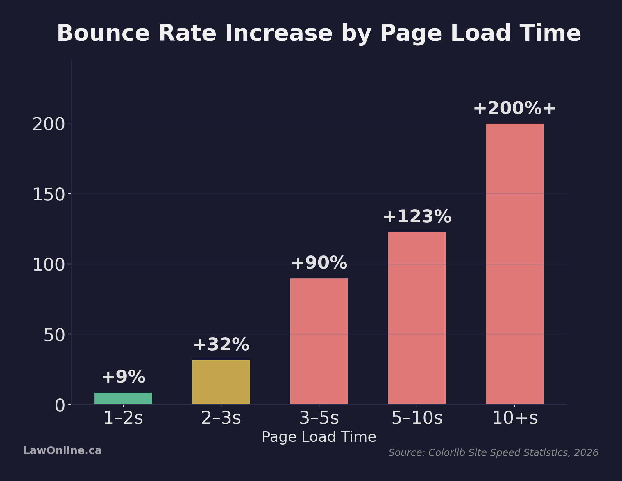
Research compiled by Colorlib's 2026 site speed analysis quantifies exactly how steep the cost is. Pages loading in two to three seconds see about a 32% increase in bounce rate compared to sub-second loads. Push that to three to five seconds and bounce jumps by 90%. Beyond ten seconds, bounce rates more than triple and conversion rates drop by over 40%. The same data shows that 53% of mobile visitors abandon a site entirely if it takes more than three seconds to load, and every additional second of delay costs roughly 7% of conversions.
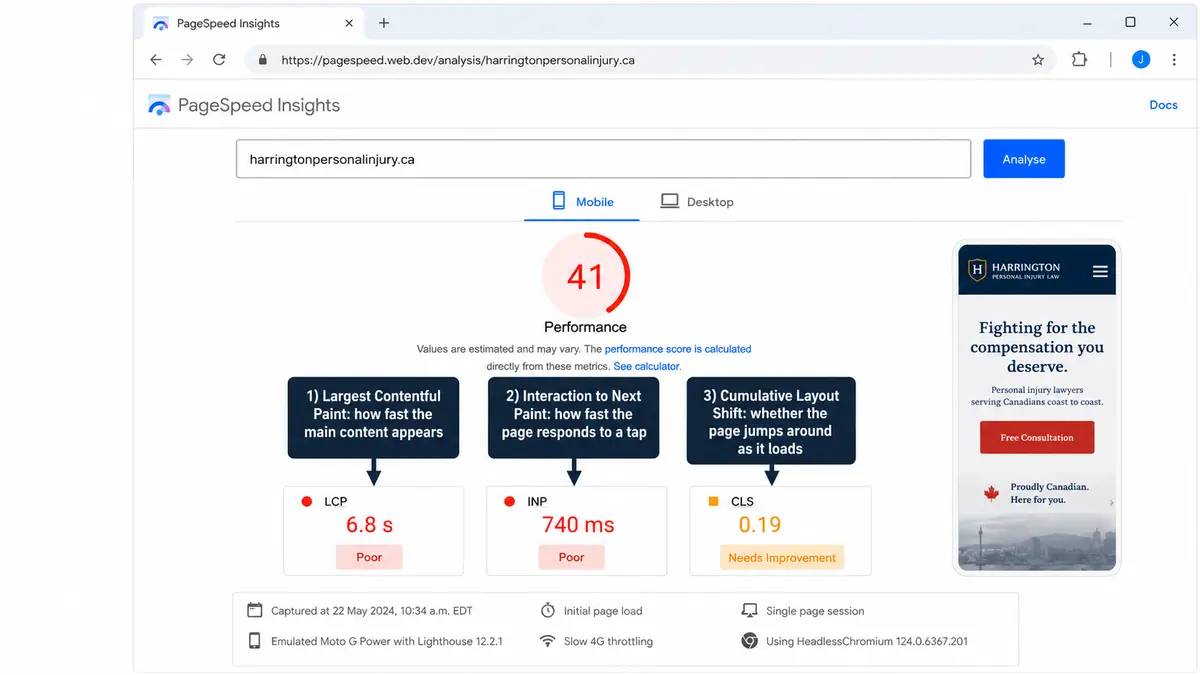
Google measures this with Core Web Vitals: Largest Contentful Paint (how fast the main content appears), Cumulative Layout Shift (whether the page jumps around as it loads), and Interaction to Next Paint (how quickly the page responds when someone taps a button). These metrics aren't abstract SEO signals. They're direct measurements of whether your site feels fast, stable, and responsive to a real person using it.
The biggest speed killers on law firm websites tend to be oversized hero images that weren't compressed for web, third-party scripts (chat widgets, analytics, social media embeds) loading synchronously, and hosting that can't deliver pages quickly. A full-width homepage photo of the firm's conference room that weighs 4 MB might look sharp on the designer's monitor, but it adds three seconds of load time on a 4G connection.
UX failure and SEO failure are the same event here. A slow site frustrates visitors (bad UX) and gets penalized in search rankings (bad SEO). Fixing speed problems improves both at once, which makes it one of the highest-return investments a firm can make in its website.
Content Hierarchy: What Visitors See First Matters
Above-the-fold content, what loads in the browser window before the visitor scrolls, is where most people decide whether to stay or leave. You have roughly five seconds to communicate three things: what you do, who you serve, and how to get in touch. If any of those are missing from the initial viewport, you're relying on visitors to scroll and explore. Most won't.
The most common mistake law firm websites make above the fold is leading with something that looks impressive but communicates nothing. A full-width photo of a courthouse, a rotating carousel of partner headshots, or a vague tagline like "Committed to Excellence in Legal Service" doesn't tell a visitor anything useful. Compare that to a personal injury firm that opens with "Toronto Personal Injury Lawyers" in large text, a one-line value proposition like "No fee until we win your case," and a prominent "Free Consultation" button. The second version tells the visitor exactly what they need to know in under three seconds.
Trust signals should appear early too. Bar association membership, years in practice, and, for personal injury firms, notable case results or total recoveries, all build credibility quickly. These don't need to dominate the page, but they should be visible without scrolling. A small line of trust badges or a single statistic ("$50M+ recovered for Ontario accident victims") does more work above the fold than a three-paragraph firm history does below it. Every missing trust signal above the fold is a missed law firm website conversion opportunity, because visitors who don't trust you won't scroll far enough to find the contact form.
Content hierarchy also applies to practice area pages. Each page should open with what this practice area means for the client, not with the legal definition. A personal injury "slip and fall" page that opens with "Occupiers' liability under the Occupiers' Liability Act, R.S.O. 1990 governs..." has lost the reader. One that opens with "If you were injured on someone else's property because of a hazard they should have fixed, you may have a claim" keeps them.
Forms and Intake Flow: The Last 10 Meters
The intake form is the conversion event. Everything else on the site, the navigation, the content, the speed, the mobile experience, exists to get a visitor to this point. And yet most law firm contact forms are designed as afterthoughts, built by whoever set up the WordPress theme rather than by someone who understands how client intake actually works.
The most common intake form mistakes:
- Asking too many questions upfront. Name, phone number, and a brief description of the situation is all you need to start a conversation. Case type dropdowns, date-of-incident fields, and "how did you hear about us" selectors add friction and reduce completions. Get the lead first, qualify later.
- Putting the form on a separate page. The best-converting law firm sites embed a short form on every practice area page, not just on a dedicated "Contact Us" page. If someone is reading about car accident claims and decides they want help, the form should be right there, not a click away.
- No confirmation or auto-response. When someone submits a form, they need immediate confirmation that it worked and that someone will follow up. A blank page or a generic "thank you" message with no timeline creates anxiety, especially for a personal injury client who is already stressed.
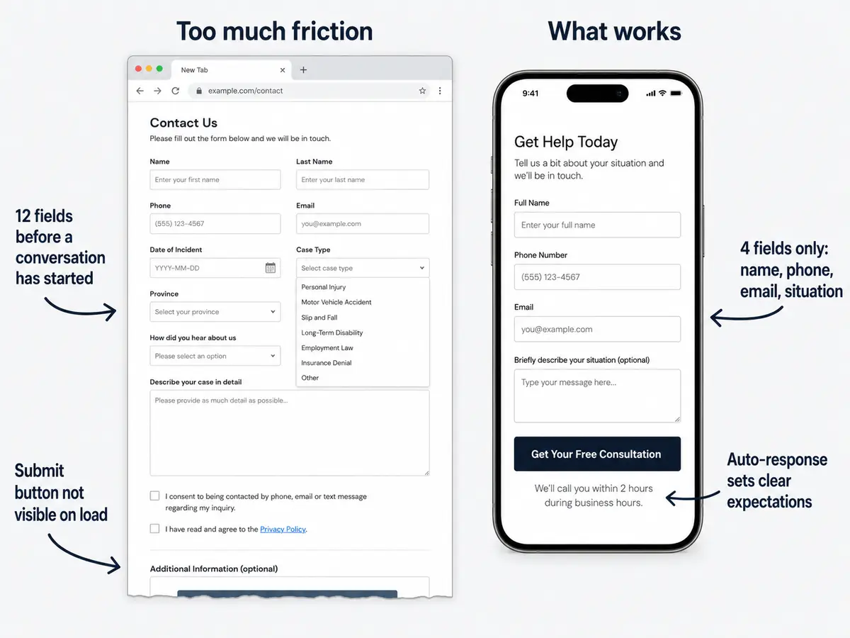
The ideal client intake flow is short, fast, and reassuring. Three to four fields maximum, a clear submit button, and an auto-response that sets expectations ("We'll call you within 2 hours during business hours"). That's it. Every additional field, every unnecessary step, and every moment of uncertainty costs you completed submissions. Think of the form as a lead capture tool, not a case evaluation questionnaire. Qualification happens on the phone.
How to Audit Your Law Firm Website's UX in 30 Minutes
You don't need to hire a consultant to identify the biggest UX problems on your site. This law firm website audit takes 30 minutes and covers the issues that cost the most consultations. Set a timer and run through this checklist:
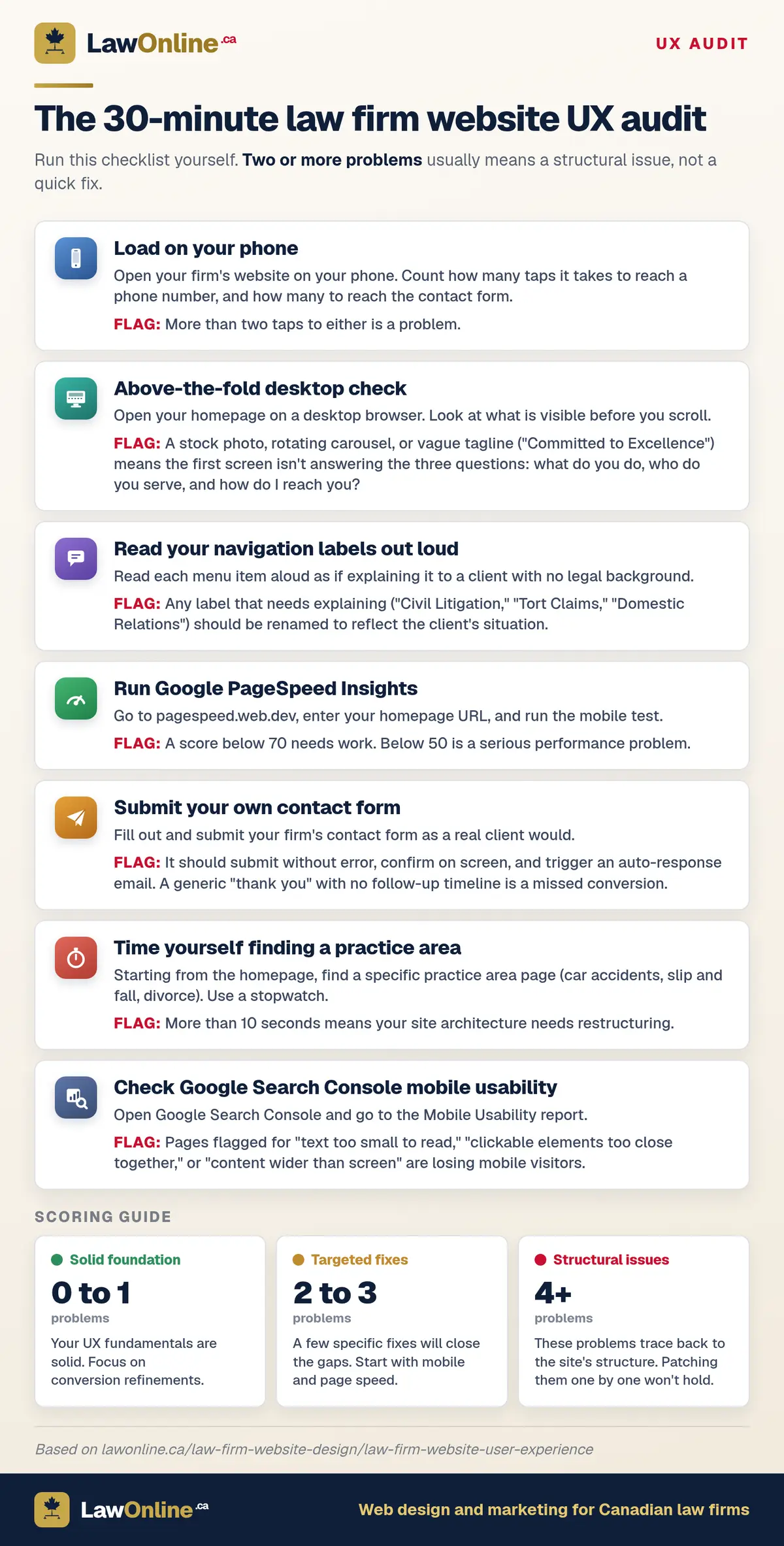
- Load the site on your phone. Count how many taps it takes to reach the phone number and the contact form. If either takes more than two taps, that's a problem.
- Check above-the-fold content on desktop. Does the first screen clearly communicate what you do, who you serve, and how to get in touch? If it's a stock photo with a vague tagline, it's not working.
- Read your navigation labels out loud. Would a non-lawyer understand every item? If you have to explain what "Civil Litigation" means, rename it.
- Run Google PageSpeed Insights. Enter your homepage URL and check the mobile score. Anything below 50 means serious performance problems. Below 70 still needs work.
- Submit your own contact form. Does it work? How long does it take? Do you get a confirmation? Is the auto-response helpful or generic?
- Try finding a specific practice area from the homepage. Time yourself. If it takes more than 10 seconds, your site architecture needs restructuring.
- Check your Google Search Console mobile usability report. It flags pages with clickability issues, text too small to read, and content wider than the screen.
If this law firm website checklist reveals more than two or three problems, you're probably looking at structural issues that patches won't fix. A site with navigation problems, slow page load times, and poor mobile UX wasn't built with client conversion in mind, and layering fixes on top of a flawed foundation rarely works. That's when it's worth considering a full redesign that starts from how your clients actually use the site, not from how the firm wants to present itself.
For a broader look at the design principles that underpin effective law firm web design in Canada, start there.