
Most law firm websites have the same problem: they talk about the firm instead of the person reading the page. The homepage lists awards. The bio pages read like resumes. The practice area pages say "we fight for you" and nothing else. And the contact page is an afterthought with a phone number buried under a stock photo of a gavel.
The result is a website that technically exists but doesn't do anything. It doesn't rank, it doesn't convert, and it doesn't answer the questions potential clients are actually asking. If you've ever wondered why your site gets traffic but no calls, the content on your pages is almost certainly the reason.
This post is a page-by-page blueprint for lawyer website content that actually works: what goes on each page, what to cut, and what most firms get wrong.
What Are the Core Pages Every Law Firm Website Needs?
Every law firm website needs five pages working before anything else matters: a homepage, practice area pages, attorney bios, a contact page, and an about page. That's it. Everything else, blog posts, FAQs, resource libraries, testimonial pages, is optional until those five are strong.
Most firms get this backwards. They invest heavily in homepage design, add a blog they update twice, and treat practice area pages as an afterthought. But practice area pages are where organic search traffic actually lands. A potential client in Toronto searching "car accident lawyer Toronto" isn't going to hit your homepage. They're going to land on your motor vehicle accident practice area page, and if that page is 150 words of generic copy with no useful information, they're hitting the back button.
The hierarchy should match how clients actually navigate. Someone searching for legal help doesn't start at your homepage and browse. They search for a specific problem, land on a specific page, and decide within seconds whether you can help. Your website's design matters, but the content on that page is what makes them stay or leave.
Practice Area Pages: The Most Neglected Content on Law Firm Websites
Practice area pages are where SEO and conversion intersect. They rank for the keywords potential clients use ("personal injury lawyer Ottawa," "family lawyer Barrie," "employment lawyer Vancouver") and they're the page that needs to convert that visitor into a consultation. Most fail at both because the law firm content writing on those pages is too thin and too generic.
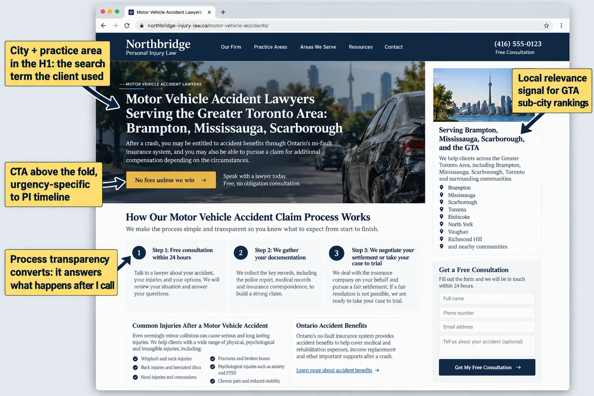
Here's what a strong practice area page includes:
- What the firm handles, specifically. Not "personal injury" but "motor vehicle accidents, slip and fall injuries, long-term disability denials, and wrongful death claims." Specificity signals competence and helps the page rank for long-tail keywords.
- How the process works. A personal injury client wants to know: what happens after I call? Do I need to pay upfront? How long does a typical claim take? Answer these on the page itself, not behind a "book a consultation" wall.
- What the client should do next. This is the intake path. A clear CTA that matches the urgency of the situation. For a PI firm, that might be "If you've been injured in the last 30 days, call us directly" rather than a generic "contact us" button.
- Local relevance. If you serve specific cities or regions, mention them naturally. "We represent accident victims across the Greater Toronto Area, including Brampton, Mississauga, and Scarborough" does more for local SEO than a generic service description.
A personal injury firm's motor vehicle accident page should explain what documentation the client needs to gather, how contingency fee arrangements work in Ontario, and what happens during the typical stages of a claim. That's 600 to 1,200 words of genuinely useful content, and it outranks a 150-word page every time because it actually answers the questions people are searching for.
Attorney Bio Pages: Where Most Law Firms Lose Clients
Clients hire lawyers they trust, and bio pages are where that trust is built or lost. The problem is that most law firm bios read like LinkedIn profiles: called to the Bar in 2009, LL.B. from Osgoode, member of the Canadian Bar Association. That information is verifiable, but it tells a potential client nothing about what it's actually like to work with this lawyer.
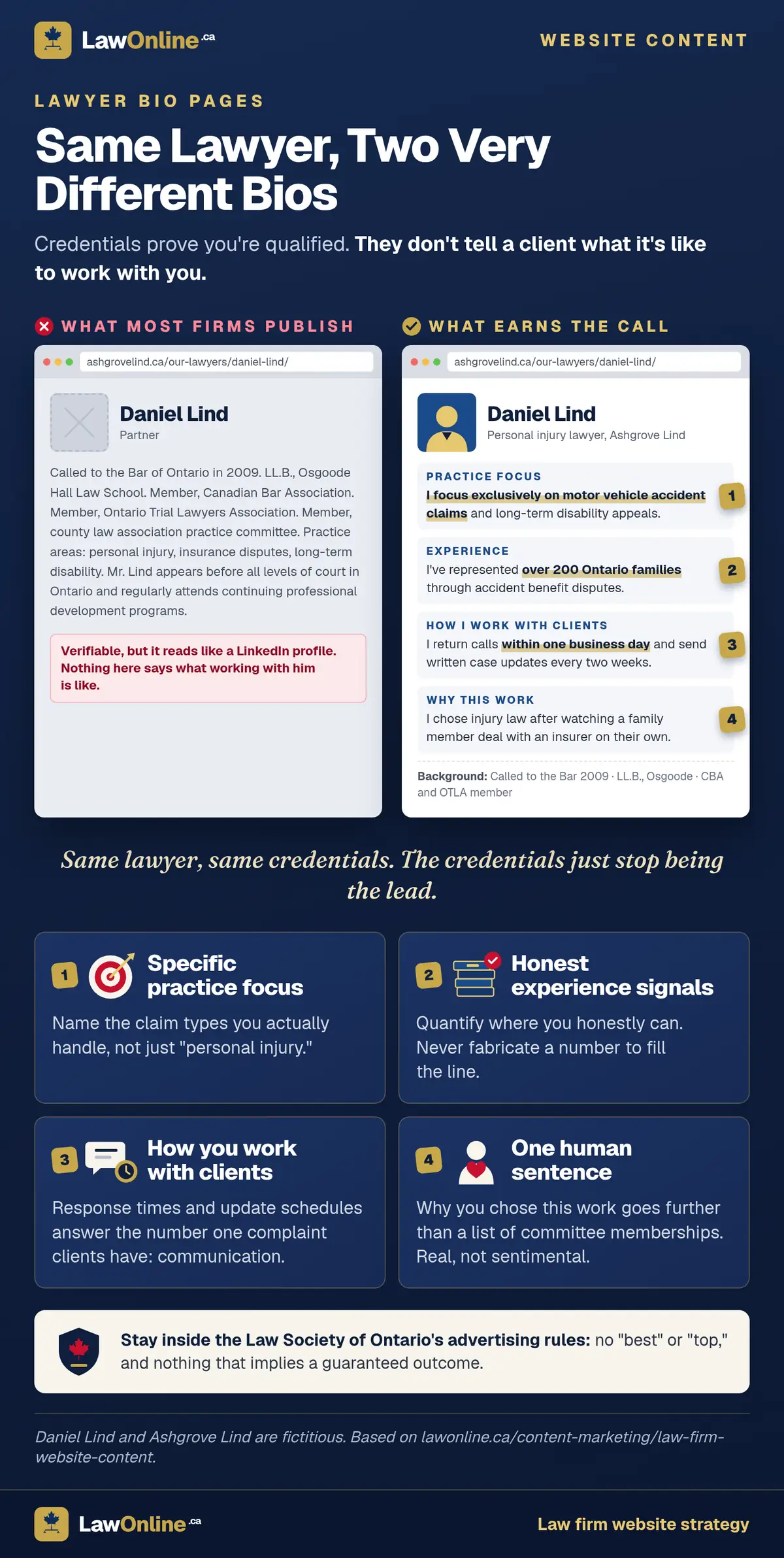
What converts on attorney bio pages:
- Specific practice focus. "I focus exclusively on motor vehicle accident claims and long-term disability appeals" is stronger than "I practice in the area of personal injury."
- Volume and experience signals. "I've represented over 200 Ontario families through accident benefit disputes" gives the reader a concrete reason to trust this person. You don't need to fabricate numbers, but you should quantify where you honestly can.
- How they work with clients. "I return calls within one business day and provide written case updates every two weeks" addresses the number one complaint clients have about lawyers: communication.
- A human element. A sentence about why this lawyer chose their practice area goes further than a list of committee memberships. It doesn't need to be sentimental, just real.
A well-written attorney bio runs 300 to 500 words. That's long enough to cover practice focus, experience, work style, and a human touch without padding it with committee memberships nobody reads.
The Law Society of Ontario's advertising rules govern what you can and can't say on these pages, so avoid superlatives like "best" or "top" and steer clear of anything that implies a guaranteed outcome. But within those boundaries, there's plenty of room to write a bio that sounds like a person instead of an institution.
The Homepage: It's Not About the Firm
Most law firm homepages are about the firm. The founding year, the awards, a rotating hero banner with partner headshots. None of that answers the question the visitor is actually asking: can this firm solve my problem?
Your homepage should answer that question in the first three seconds. That means:
- A clear value proposition above the fold. Not a tagline like "Experienced. Dedicated. Results." but a statement that tells the visitor what you do and who you do it for. "Personal injury lawyers serving the Greater Toronto Area. No fees unless we win your case" works because it names the practice area, the geography, and the fee structure in one line.
- Practice areas, prominently displayed. Not buried in the footer or hidden behind a dropdown. Visitors need to see within seconds that you handle their type of case.
- A phone number and contact CTA that's impossible to miss. The homepage is often the highest-traffic page on the site. If the phone number is in 12-point font in the header and nowhere else, you're losing calls.
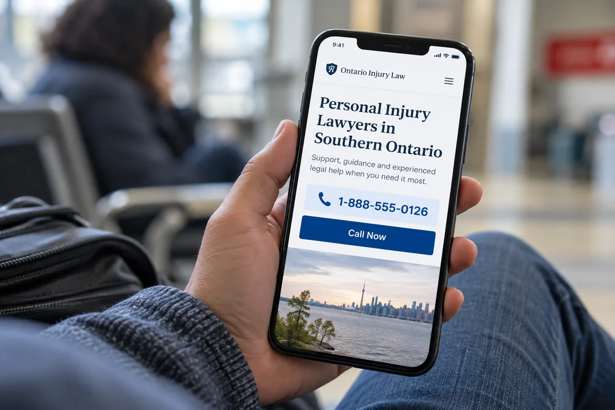
What doesn't convert: rotating hero images (visitors ignore them), law firm website copy that's all about the firm's history, and generic taglines that could apply to any business in any industry. Save the founding story for the about page. The homepage exists to route visitors to the right practice area page or straight to the phone.
Your website build process should start with homepage content strategy, not design. The design should serve the content, not the other way around.
What Should a Law Firm Contact Page Include?
The contact page is a conversion asset, not a formality. For some practice areas, especially personal injury, it's the most important page on the site after practice area pages because someone who reaches the contact page has already decided they might need your help.
Good contact page content includes:
- Response time. "We respond within 2 hours on business days" sets an expectation and creates urgency. For PI firms, something like "If you've been in an accident in the last 48 hours, call us directly" matches the emotional state of the visitor.
- Phone number, prominently displayed. Not just in the header. On the contact page itself, large and clickable on mobile.
- Office address and hours. This helps with local SEO and with Google Business Profile NAP consistency.
- A simple intake form. Ask for name, phone number, email, and a brief description of the legal matter. That's it. Dropdown menus with 15 practice area options, "describe your legal matter in detail" as a required field, and CAPTCHA puzzles all reduce form completions.
The goal of the contact page is to reduce friction between "I think I need a lawyer" and "I just contacted one." Every additional field, every unnecessary step, and every missing piece of information (like what happens after they submit) costs you consultations. Good conversion optimization starts here.
About Page and Trust Signals
The about page is read by clients who are nearly ready to call. They've seen your practice area page, they've read a bio or two, and now they want to know whether this firm feels right. The about page seals the decision.
What to include:
- A brief firm story. When the firm was founded, by whom, and what need it was created to serve. Keep this to two or three sentences. Most visitors don't care about a detailed chronology, but they do want to know there's a real story behind the name.
- Who the firm serves. Be specific about your client base and geographic reach. "We represent individuals and families across Ontario in personal injury, disability, and insurance disputes" is better than "we serve clients in various practice areas."
- What makes the approach different. This is the hardest part to write because most firms aren't that different. But if your firm has a genuine differentiator, like a specific case methodology, a focus on a niche practice area, or a commitment to response times, name it here.
- Trust signals. Years in practice, number of lawyers, specific geographic markets served, professional associations like the Canadian Bar Association or OTLA for personal injury firms, and any notable recognitions. These should be factual and verifiable, not puffery.
A good about page is 400 to 600 words. Long enough to tell the story and establish credibility, short enough that a visitor who's nearly ready to call doesn't lose patience.
Do not include outcome guarantees, comparative superlatives ("the best personal injury firm in Ontario"), or anything that reads like marketing copy rather than information. The about page works best when it feels like a straightforward introduction rather than a sales pitch.
What Should You NOT Put on a Law Firm Website?
Knowing what to cut is as important as knowing what to write. These are the most common content problems on law firm websites:
- Stock photos of gavels, courtrooms, and handshakes. Potential clients recognize these instantly, and they signal that the site is generic. If you don't have real photos of your team or office, a clean design with no photos outperforms obvious stock imagery.
- Outcome claims or guarantees. "We win 95% of our cases" is both unverifiable and potentially a regulatory issue. Provincial law societies restrict this kind of advertising for good reason, and sophisticated clients don't believe it anyway.
- Dense legalese. If your website reads like a retainer agreement, you're writing for lawyers, not for clients. The person reading your site is stressed, confused, and looking for help. Write for them.
- Practice areas you don't actively handle. Listing "intellectual property" when you haven't taken an IP matter in three years wastes the visitor's time and dilutes your site's authority. Every page on your site should represent work you actively do.
- Blog posts from 2018 that were never updated. An outdated blog signals neglect, not authority. If a post references legislation that's been amended or statistics that are five years old, it actively hurts credibility. Either update old content or remove it.
These aren't just style choices. Provincial law societies regulate what lawyers can publish on their websites, and the rules vary across the country. Ontario prohibits outcome guarantees and misleading comparisons. Some provinces restrict or heavily regulate client testimonials on websites. Alberta and British Columbia each set their own boundaries on what counts as advertising versus information, so a claim that's fine in one jurisdiction can trigger a complaint in another. If you're unsure what your site can say, review your law society's advertising guidelines before publishing.
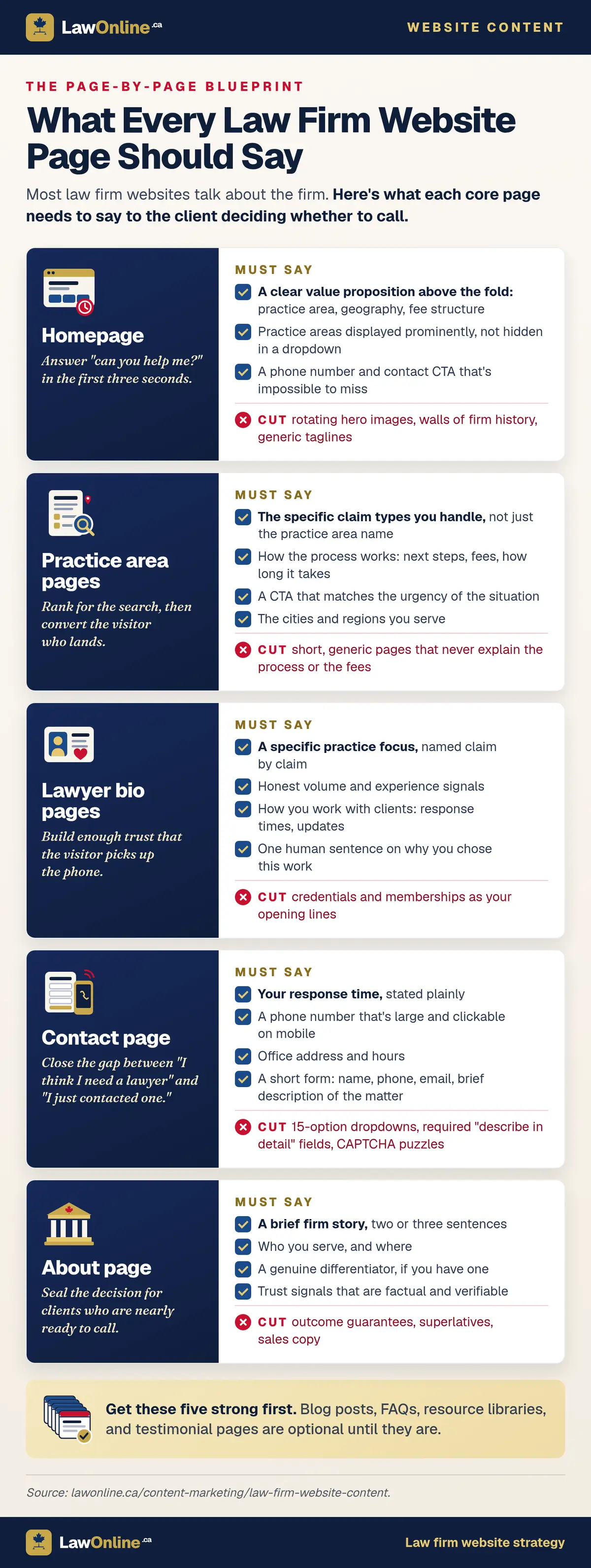
The instinct to add more content to a website is usually wrong. A focused site with five strong pages outperforms a sprawling site with thirty mediocre ones because search engines and clients both reward depth over breadth.
How Do You Audit Your Website's Existing Content?
Before writing any new lawyer website content, audit what you already have. Most law firm websites have content problems that are fixable with edits rather than a full rebuild.

Run through this checklist for every page on your site:
- Does the practice area page answer what the client wants to know? Read each page from the client's perspective. If the page talks about the firm's capabilities but doesn't explain the process, the fees, or what happens after they call, it needs a rewrite.
- Is the intake CTA above the fold? If a visitor has to scroll to find the phone number or contact form, you're losing conversions. Check this on mobile especially, where most legal searches happen.
- Are the bio pages human or institutional? Read each bio and ask: would I call this person based on what's written here? If the bio reads like a credential list with no personality, rewrite it.
- Does the homepage answer "can you help me?" in three seconds? Load your homepage as if you've never seen it before. If you can't tell what the firm does, who it serves, and how to get in touch within three seconds, the content isn't working.
- Is anything outdated? Look for old dates, references to repealed legislation, expired statistics, or blog posts that haven't been touched in years. Outdated content is worse than no content.
If the audit reveals more gaps than you can fix with page-by-page edits, a full content strategy overhaul is the right move. That starts with understanding what your site needs to accomplish and building every page around that goal, which is where professional legal website design and content strategy come together.