
Your law firm's website isn't just a digital business card. It's your highest-volume business development tool, operating 24 hours a day, 7 days a week. When it fails, you lose clients you'll never even know about.
Web design for law firms in Canada carries a few extra considerations: bilingual obligations in Quebec, provincial law society advertising rules that vary from Ontario to BC, and a client population that's increasingly mobile-first. Generic templates built for American firms often miss these details entirely. For a complete guide to what strong law firm website design looks like in Canada (the build process, what makes a site actually convert, and what to avoid), visit our hub.
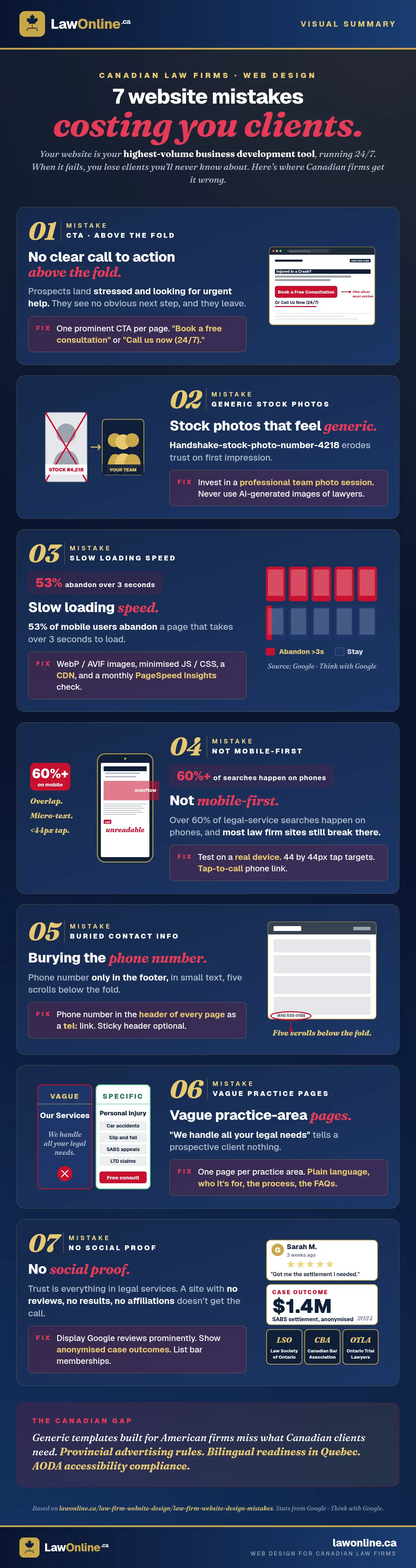
Here are the seven design mistakes we see most often, and what to do instead.
1. No Clear Call to Action Above the Fold
When a prospective client lands on your homepage, they're often stressed, looking for urgent help. If your first screen doesn't immediately tell them what to do next (call, book a consultation, submit their details), they'll leave.
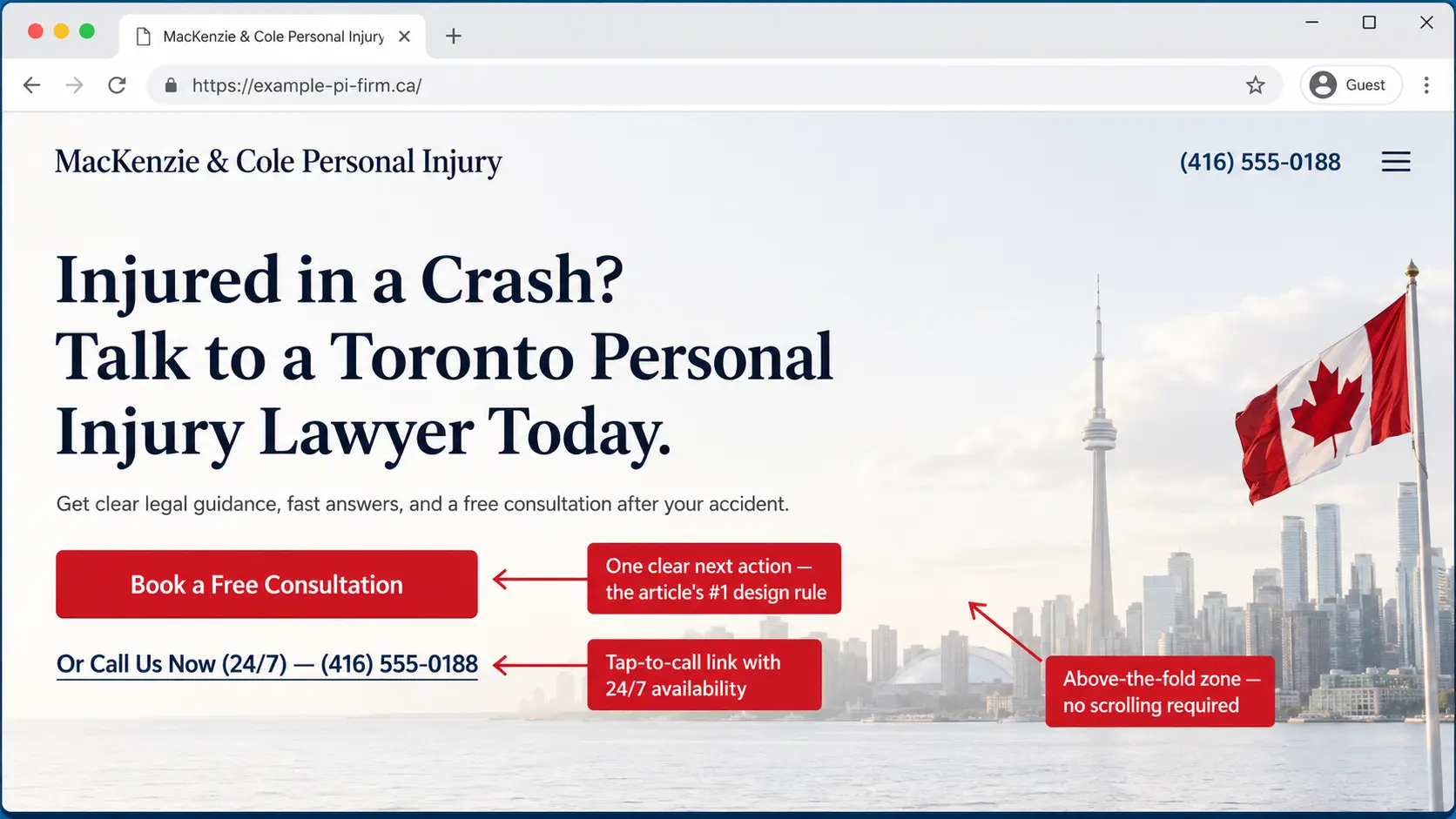
The fix: Every page should have one clear, prominent call to action. "Book a free consultation" or "Call us now (24/7)." Something that removes friction and creates urgency. Don't forget: most visitors aren't entering your site on your homepage. Many of them will never even see it.
2. Stock Photos That Feel Generic
Nothing erodes trust faster than a homepage hero image featuring handshake-stock-photo-man-in-suit-number-4,218. Canadian clients want to see the real people who will represent them.
The fix: Invest in a professional headshot session for your team. A genuine, well-lit team photo converts far better than any stock image. And don't even get us started on AI-generated images.
3. Slow Loading Speed
Google's research shows that 53% of mobile users will abandon a page that takes more than 3 seconds to load. For law firm websites packed with oversized images and outdated plugins, slow load times are endemic. You can check your site's AI readiness and technical health for free to see where you stand.
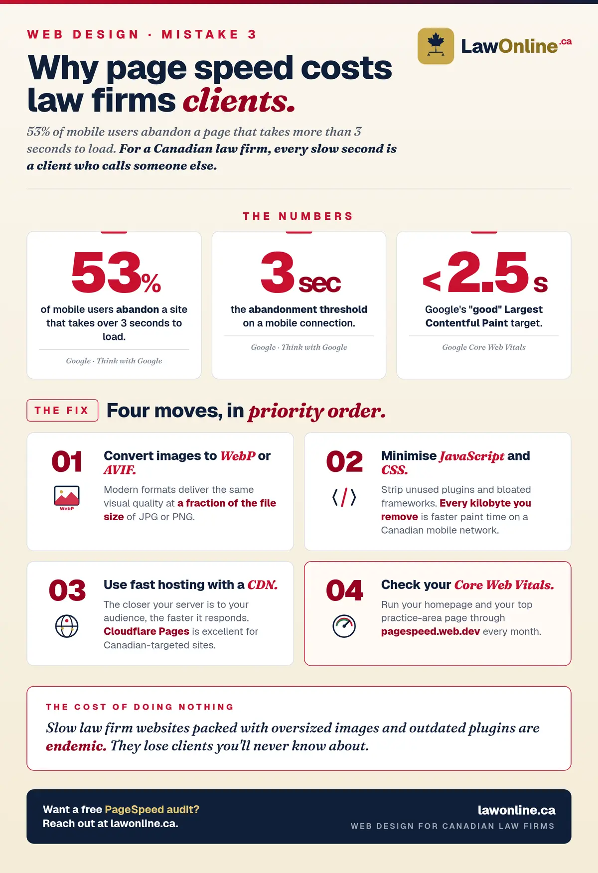
The fix:
- Compress and convert images to WebP or AVIF format
- Minimise JavaScript and CSS
- Use a fast hosting provider with a CDN (Cloudflare Pages, for instance, is excellent). The closer your server is to your target audience, the faster it will respond.
- Check your Core Web Vitals score at PageSpeed Insights
4. Not Mobile-First
Over 60% of legal service searches happen on mobile devices. If your website is hard to navigate on a phone (tiny text, difficult-to-tap buttons, horizontal scrolling), you're losing clients.
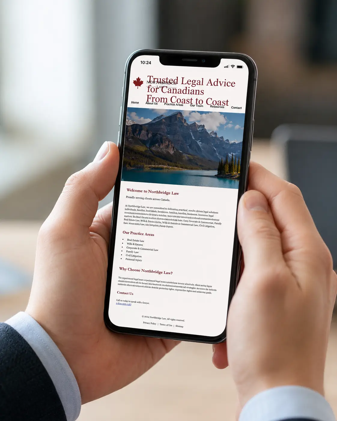
The fix: Test your site on a real mobile device, not just by resizing your browser window. Ensure buttons are at least 44×44px, font sizes are readable without zooming, and the phone number is a tap-to-call link.
5. Burying Contact Information
We regularly see law firm websites where the phone number appears only in the footer, in small text, after scrolling through five sections of content. This is a cardinal sin. There's a decent chance your potential client is already stressed. Don't make it worse.
The fix: Put your phone number in the header of every page. Make it a <a href="tel:+1..."> link. Consider a sticky header that stays visible as users scroll.
6. Vague Practice Area Pages
"We handle all your legal needs" communicates nothing. Potential clients searching for a specific type of lawyer want reassurance that you do exactly what they need, that you've handled cases like theirs before, and that you understand their situation.
The fix: Create dedicated pages for each practice area. Each page should explain the practice area in plain language, describe who it's for, outline your process, and include relevant FAQs.
7. No Social Proof
Trust is everything in legal services. Client testimonials, case results (where ethically permissible under Law Society rules), and professional affiliations all build the confidence a prospect needs to pick up the phone.
The fix: Collect and display Google reviews prominently. Feature anonymised case outcomes or client success stories. Show bar association memberships and professional designations.
Is Your Website Costing You Clients?
The good news: every one of these mistakes is fixable. If you're ready to start fresh, our guide to the law firm website design process walks you through what to expect from first call to launch, and our WordPress vs. static site comparison can help you choose the right platform before you build. At LawOnline.ca, we audit law firm websites and build replacements that actually convert. Our content marketing team produces the substance these sites are designed to display.
Request your free website audit today and we'll identify exactly what's holding your online presence back.
Frequently Asked Questions
What is the most important design element on a law firm website?
A clear, prominent call to action above the fold. Every prospective client who lands on your homepage has one question: what should I do next? Your website's job is to answer that immediately. Whether it's a phone number, a free consultation button, or a contact form, the path to reaching you should be unmissable within seconds of landing on the page.
How fast should a law firm website load?
Google considers a Largest Contentful Paint (LCP) under 2.5 seconds "good." In practical terms, your firm's website should load its main content within 2–3 seconds on a mobile device. According to Google research, 53% of mobile users abandon a page that takes more than 3 seconds to load, a serious problem for personal injury and family law firms where clients are often searching on mobile in urgent situations.
Should a law firm use stock photos on their website?
Professional photography almost always outperforms stock images. Stock photos of suited professionals, gavels, and handshakes are overused and fail to build the personal trust that legal services require. Genuine photos of your team and office help prospective clients connect with your firm before they have picked up the phone. Even a single professional headshot session is a worthwhile investment.
What does mobile-first design mean for a law firm?
Mobile-first means designing for small screens first, then scaling up to desktop. Since over 60% of legal service searches in Canada happen on mobile devices, a website that is difficult to navigate on a phone will drive potential clients away. Google also uses mobile performance as its primary ranking signal, so a poor mobile experience hurts both conversion and search visibility.
How does website design affect a law firm's Google ranking?
Directly. Google measures page experience signals including load speed, mobile usability, and Cumulative Layout Shift. These Core Web Vitals are confirmed ranking factors. A well-structured website with clear navigation also helps Google understand and index your pages more effectively, improving visibility for the practice area and location keywords your firm needs to rank for.
What makes web design for law firms in Canada different from a generic website?
Canadian law firm web design needs to account for provincial law society advertising rules, which vary significantly between Ontario, BC, and Quebec. Content claims about outcomes, fees, and specializations must comply with each province's standards. Beyond compliance, effective web design for Canadian law firms prioritizes bilingual readiness where applicable, local trust signals (recognizable Canadian associations and credentials), and practice area pages structured around the specific legal search patterns Canadian clients use. A website built for a US law firm will rarely convert Canadian clients at the same rate as one built specifically for this market.
What is social proof and why do law firms need it on their websites?
Social proof is evidence that other clients have trusted and benefited from your services: Google reviews, testimonials, case results, awards, and professional memberships. In legal services, trust is a prerequisite for hiring. Most prospective clients will evaluate your firm's credibility before calling. Prominently displaying social proof on your website directly improves the rate at which visitors become inquiries.