Here's the uncomfortable truth about law firm websites: the vast majority of them look fine. Clean logo, professional headshots, a few pages of credentials. And they don't work.
The numbers confirm it. Industry research shows that 87% of law firms have a website, but only 35% have ever gained a client from one. That gap between "having a site" and "having a site that performs" is where most firms are stuck.
They're stuck because their websites were designed as brochures. Digital equivalents of the firm letterhead. Something to hand out at a networking event. But that's not what a website needs to be in 2026. A good law firm website is an intake engine. It finds potential clients, qualifies them, earns their trust, and gets them to pick up the phone or fill out a form. Every design choice, every word, every page should serve that single purpose.
This is especially true for smaller practices. According to Law Society of Ontario data, 72% of Ontario lawyers practise in firms of two to ten people. A Canadian Bar Association technology survey found that 65% of Canadian lawyers now use cloud-based tools including websites for client intake. The infrastructure is there. The question is whether it's designed to convert.
If your site isn't converting, it doesn't matter how polished it looks.
What Makes a Good Law Firm Website? Five Jobs It Has to Perform
A good law firm website performs five jobs simultaneously. Miss any one of them and you're leaving cases on the table. These are the design principles every firm site should be built around.

1. It Gets Found
Nothing else matters if people can't find your site. For personal injury firms especially, the clients who need you most are searching Google right now for "car accident lawyer near me" or "slip and fall attorney Toronto." Your site needs to rank for those terms.
That means proper search engine optimization, technically sound pages, and content that matches what your ideal clients are actually searching for. A gorgeous website that sits on page four of Google is functionally invisible.
2. It Qualifies Visitors Instantly
When someone lands on your site, they need to know within seconds whether you handle their type of case and serve their area. A personal injury firm in Vancouver shouldn't make visitors click through three pages to discover you only take motor vehicle accident claims in British Columbia.
Good law firm websites put practice areas and service regions front and centre. They answer the visitor's first question before they even have to ask it.
3. It Builds Trust Fast
Legal services are high-stakes. Nobody hires a personal injury lawyer the way they pick a restaurant. Visitors are skeptical, often stressed, and actively comparison shopping. FindLaw research shows that 75% of people visit two to five law firm websites before contacting anyone. Your site isn't just competing with one alternative. It's one tab among several, and you have about 10 seconds to establish that you're credible, experienced, and worth contacting.
4. It Complies with Law Society Rules
Every Canadian province has advertising rules for lawyers. The Law Society of Ontario's marketing guidelines restrict how firms can describe results. British Columbia, Alberta, and Quebec each have their own requirements. A good law firm website respects these rules. A bad one ignores them and creates regulatory risk.
5. It Converts Visitors into Contacts
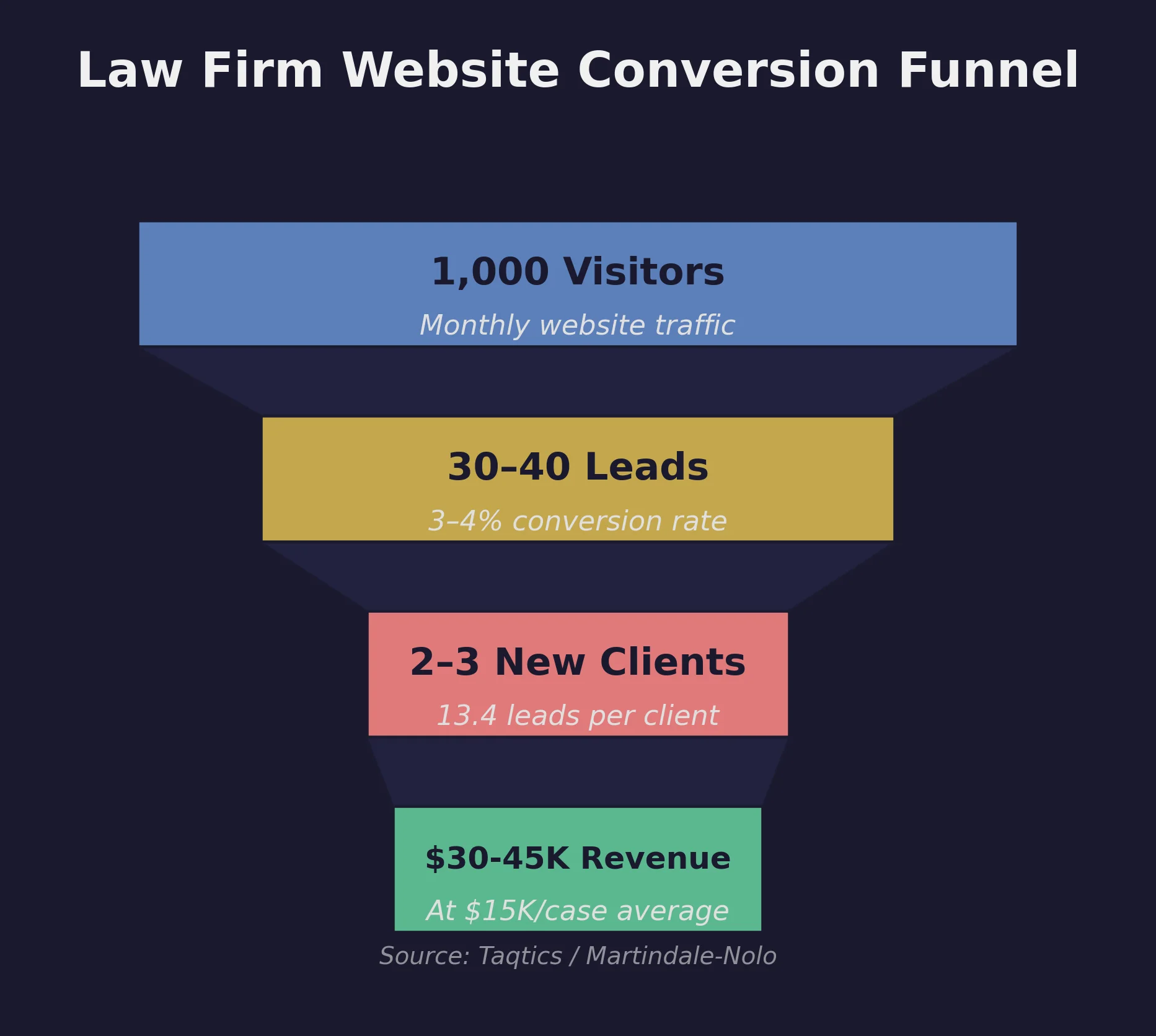
This is where most law firm websites fail hardest. The average law firm site converts just 3-4% of visitors into leads, which means 96 out of every 100 people leave without taking action. The math is sobering: at an industry average of 13.4 leads needed to sign one new client, a firm getting 1,000 monthly visitors might convert two clients per month if everything else is working. Most firms don't hit even that benchmark.
The typical culprits: no clear call to action above the fold, a contact form buried on a separate page, a phone number that isn't clickable on mobile. Converting a visitor into a lead requires deliberate design, not an afterthought.
What Does "Good" Look Like in 2026?
What counted as a good law firm website in 2018 doesn't cut it anymore. The bar has moved significantly.
Mobile-First is Non-Negotiable
More than half of legal service searches happen on mobile devices. For personal injury and family law firms, the share is even higher because people often search in urgent situations from their phones. If your site isn't fast and usable on a phone, you're losing your most motivated prospects.
Mobile-first doesn't just mean responsive. It means the mobile experience is the primary design, not a shrunk-down version of the desktop site. Buttons need to be thumb-friendly. Forms need to be short. Page speed needs to be exceptional. Google's PageSpeed Insights tool will tell you exactly where your mobile experience stands in about 30 seconds.
Performance Matters More Than Aesthetics
A beautiful site that takes five seconds to load is worse than a plain one that loads in under two. Google factors page speed into rankings, and visitors abandon slow pages before they even see your content. This is especially true on mobile, where connections can be inconsistent.
The impact of speed on conversions is well documented. Research from Google and Deloitte found that a 0.1-second improvement in load time boosts conversions by 21.6% on lead generation sites. For a firm generating 30 leads per month, that one-tenth of a second translates to roughly six additional potential clients. Speed isn't a technical nicety. It's revenue.
For a deeper look at what specific metrics to target, our guide to law firm website speed and Core Web Vitals breaks down exactly what Google measures and what scores you should aim for.
AI-Readable Structure
This one catches firms off guard. AI assistants like ChatGPT, Perplexity, and Google's AI Overviews are increasingly how people find and evaluate lawyers. These systems don't just read your text. They parse your site's structure. Proper schema markup, clean heading hierarchies, and well-organized content help AI systems understand what your firm does, where you practise, and what sets you apart. Firms with structured data are more likely to show up when someone asks an AI assistant "who's the best personal injury lawyer in Ottawa?"
Accessibility Isn't Optional
An accessible website isn't just the right thing to do. It's a legal and business imperative. Sites that meet WCAG 2.1 AA standards work better for everyone: screen reader users, people with low vision, older clients who may be adjusting font sizes, and mobile users on small screens. Accessibility improvements also tend to improve SEO and conversion rates because they force you to build cleaner, more logical page structures.
Which Credibility Signals Actually Move the Needle?
Not all trust signals are equal. Here's what actually influences whether a potential personal injury or family law client decides to call you.

Real Reviews from Real Clients
Google Business Profile reviews are the single most visible credibility signal for local law firms. Potential clients check them before they visit your website. Firms that actively collect and respond to reviews build trust before a prospect even clicks through. Display them on your site too. Not just a star rating, but actual quotes from clients describing their experience.
Named Lawyers with Real Bios
People hire people, not firms. Team pages with genuine bios, professional photos, and bar admission details perform far better than generic "Our Team" pages with stock headshots. For personal injury firms, listing relevant experience matters. Clients want to know their lawyer has handled cases like theirs.
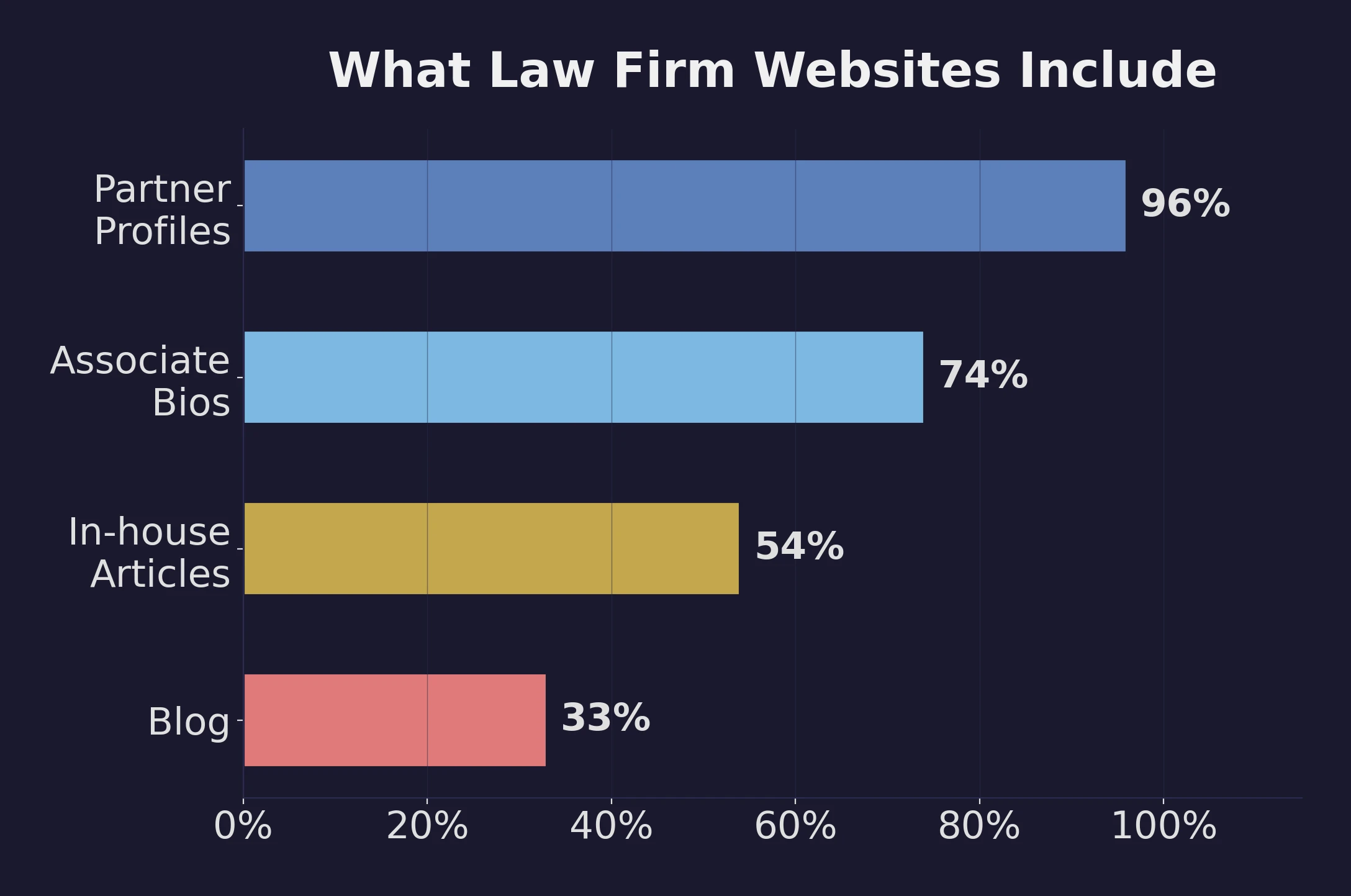
ABA survey data reinforces this: 96% of law firm websites feature partner profiles and 74% include associate bios, making lawyer pages the single most common content type on firm sites. Only 54% publish in-house articles, and just one-third maintain a blog. The near-universal presence of detailed bios isn't a coincidence. It's what visitors look for first, and firms that invest in authentic, detailed profiles rather than one-paragraph placeholders gain a real trust advantage.
Outcomes and Case Results (Where Permitted)
Where your provincial law society allows it, publishing case results and settlement ranges builds enormous credibility. A personal injury firm that can show "recovered $1.2M for a client injured in a commercial vehicle accident" communicates competence more effectively than any amount of marketing copy. Always check your law society's rules. Ontario's regulations on this differ from BC's and Alberta's.
Professional Recognition and Community Involvement
Awards, publications, speaking engagements, and bar association involvement all help. But they work best when they're specific. "Named to Best Lawyers in Canada, 2025, Personal Injury" carries more weight than a wall of logos without context.
What Are the Most Common Law Firm Website Traps?
Knowing what to avoid is just as important as knowing what to include. These are the patterns that make law firm websites underperform, and they're alarmingly common.

Stock Photos of Gavels and Handshakes
This is the single fastest way to make your site look generic. When a personal injury client is looking for help after a serious accident, a stock photo of a gavel or a staged handshake tells them nothing about your firm. It actually signals that you didn't invest in making your site authentic. Use real photos of your team, your office, your city. If you don't have professional photos yet, well-designed graphics or your local skyline beats stock-photo-gavel-number-47,000 every time.
Copy That Could Belong to Any Firm
"We are passionate about justice." "Our dedicated team fights for your rights." "We treat every client like family." If you've written anything like this on your site, you've just described every law firm in Canada. Good website copy is specific. It names your practice areas, your geography, your approach, and your actual results. It sounds like your firm, not a template.
For guidance on how to develop content that actually differentiates your firm, take a look at common website design mistakes that make firms blend into the background.
Burying the Contact Information
Some law firm websites treat contact information like a secret. The phone number is in 12-point font in the footer. The contact form is on its own page, three clicks deep. The email address is a "mailto:" link that opens a desktop email client nobody uses anymore.
Good law firm websites make contact information impossible to miss. Sticky header with a phone number. Contact form on every practice area page. Click-to-call buttons that work on mobile.
The urgency factor is backed by data. Research shows that 67% of potential clients factor response speed into their hiring decision, and firms that respond within five minutes see 400% higher conversion rates compared to those that wait. For personal injury firms, where clients are often in crisis, reducing friction by even one click can be the difference between getting the case and losing it to the firm that made it easier to reach out.
Ignoring Local SEO Fundamentals
Your website doesn't exist in isolation. It works alongside your Google Business Profile, your directory listings, and your local content strategy. Firms that optimize their site but neglect their GBP, or vice versa, leave rankings and cases on the table. Your name, address, and phone number should be consistent everywhere. Your GBP should link to the right pages. Your site should have location-specific content for every region you serve.
How Can You Audit Your Own Law Firm Website in 20 Minutes?
You don't need to be a web developer to evaluate whether your site is following law firm website best practices. Run through this checklist and you'll have a clear picture of where you stand.
Speed and Performance (5 minutes)
- Run your homepage through Google PageSpeed Insights. Score above 90 on mobile? You're ahead of most firms. Below 50? That's a problem.
- Load your site on your phone over cellular data. Does it feel fast? Can you read everything without pinching to zoom?
Trust and Credibility (5 minutes)
- Can a first-time visitor tell what you do and where you practise within five seconds of landing on your homepage?
- Do your lawyer bios include real photos, bar numbers, and practice area experience?
- Are client reviews visible on your site, not just on Google?
Conversion Readiness (5 minutes)
- Is there a phone number or contact form visible on every page without scrolling?
- On mobile, can someone tap to call with one touch?
- Try submitting your own contact form. Does it actually work? How long until you get the notification?
SEO Basics (5 minutes)
- Search Google for your firm name. Do you appear first? Is the information accurate?
- Search for "[your practice area] lawyer [your city]." Are you on the first page?
- Does your Google Business Profile match the information on your website?
If you're failing more than two of these checks, your website is costing you clients. The good news is that most of these issues are fixable, and the firms that fix them first get a real competitive advantage.
Your Website Is Your Hardest-Working Employee
A good law firm website works around the clock. It doesn't take sick days, doesn't miss calls, and doesn't forget to follow up. But it only works if it's designed to do the job, not just to look professional.
The investment doesn't have to be enormous, but it does have to be intentional. Industry data shows that law firms typically allocate between 2% and 10% of revenue to marketing including web design, spending $5,000 to $50,000 monthly on digital channels. Yet only 47% of firms even have a formal annual marketing budget, down from 57% in 2022. The firms that budget deliberately and design for conversion consistently outperform those that treat their website as a one-time expense.
The ROI of getting this right is substantial. Case studies across the legal marketing industry show that purpose-built law firm website redesigns have produced triple-digit increases in traffic and leads, with some firms seeing lead growth above 800%. The common thread isn't the size of the budget. It's building a site designed to convert, not just to exist.
If you're not sure where your site stands, start with the 20-minute audit above. And if you want a professional assessment, our law firm website services include a full technical and conversion audit to identify exactly what's holding your site back.